SosialSparkLab
45 Hauntingly Good Halloween Fonts to Spook Up Your Canva Designs
This roundup pulls together 45 fonts, grouped by the specific flavor of spooky they bring — bone-chilling and gothic, cartoon-cute, elegantly handwritten, or built around a specific Halloween character. Pick from the mood that fits your project rather than scrolling through all 45 hoping something jumps out.
October has a font problem most people don't think about until they're already mid-design: regular typefaces just don't read as "spooky." A clean sans-serif on a Halloween Pinterest pin looks like a mistake, not a choice. What actually sells the mood is dripping ink, jagged edges, cobwebs woven into the letterforms — the kind of detail you can't fake with a bold weight and an orange color swap.
This roundup pulls together 45 fonts, grouped by the specific flavor of spooky they bring — bone-chilling and gothic, cartoon-cute, elegantly handwritten, or built around a specific Halloween character. Pick from the mood that fits your project rather than scrolling through all 45 hoping something jumps out.
Creepy & Gothic Display Fonts
For designs that lean into genuine dread rather than trick-or-treat cuteness.
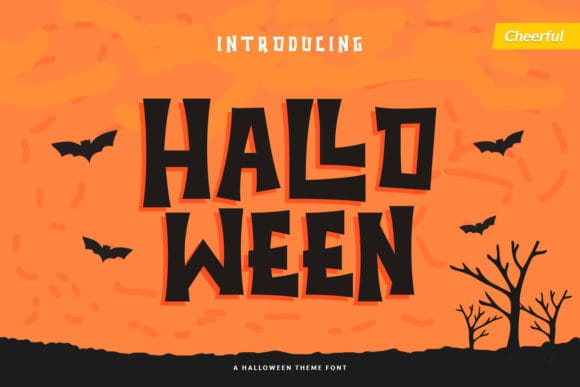
A display font with enough weight to anchor a headline on its own — available in both a colored and solid-black version, so you can match it to whatever palette your design already has.
Best for: Instagram Halloween announcement graphics, poster-style Pinterest pins.
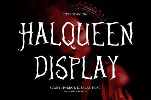
A bold, eye-catching horror-style display font with jagged, dramatic letterforms — built specifically for the kind of eerie, high-impact headline that needs to read as unsettling from across a page.
Best for: Horror movie night graphics, haunted house flyers, scary poster-style Pinterest pins.
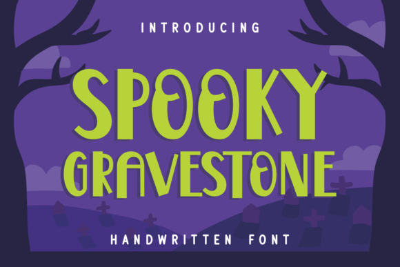
A display font with slightly uneven, hand-cut characters — playful rather than polished, closer to a hand-carved tombstone inscription than a smooth script.
Best for: Cemetery-themed party decor, Halloween signage, rustic invitation lettering.
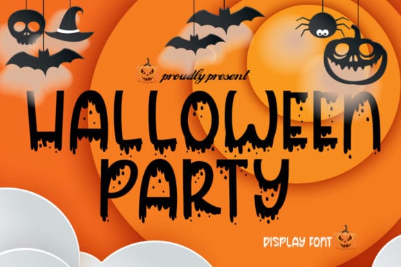
The blood-drip detailing is built into the letterforms rather than added as a text effect, so it holds up cleanly even at smaller sizes.
Best for: Horror movie night graphics, bold event headers.
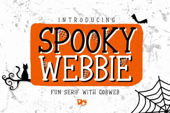
Cobwebs are worked directly into the strokes of each letter — a detail that reads instantly as Halloween without needing extra graphic elements layered on top.
Best for: Haunted house flyers, spooky product labels.
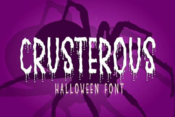
Thick, chunky letterforms built for maximum visibility from a distance — this is a font that's meant to be seen across a room, not read up close.
Best for: Event banners, oversized Pinterest pin titles.
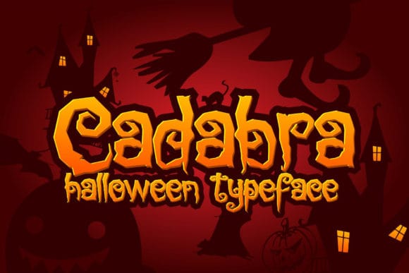
A tidy, versatile display font with just enough irregularity in the strokes to feel a little unsettling — works as well in a thumbnail as it does in a full headline.
Best for: YouTube thumbnails, spooky-themed branding.
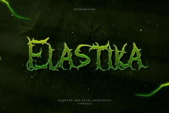
Sharp, uneven strokes that feel lifted straight from a vintage horror movie poster — one of the moodier picks on this list, with little of the cartoon warmth found elsewhere.
Best for: Horror-themed branding, moody Halloween invitations.
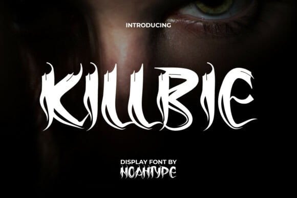
Claw-like, jagged serifs with a tattoo-culture edge — closer to dark fantasy than classic horror, and one of the few fonts here that reads as "elegant" even while being genuinely menacing.
Best for: Slasher-movie titles, dark album art, edgy merch designs.
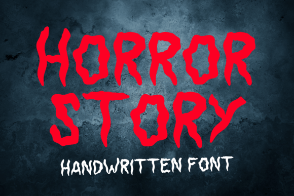
Bone-shaped letterforms instead of the usual blood-drip motif — a different visual language from most gothic Halloween fonts, useful if your design already has plenty of red in it.
Best for: Halloween invitations, event postcards, poster headings.
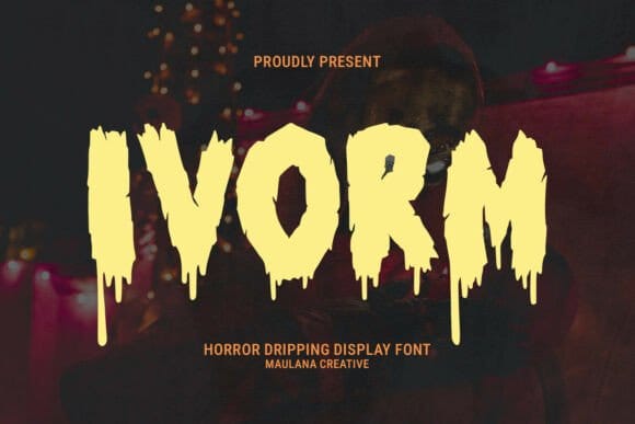
Thick, heavy strokes that look like they're melting rather than dripping — a slimier, more "gore" take than the blood-drip fonts already on this list.
Best for: Scary movie titles, game logos, haunted house flyers.
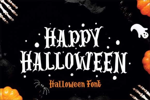
Bold, gothic-inspired letterforms with elongated, twisted serifs — cobweb patterns and bat-wing details are worked directly into individual characters rather than added as separate decoration, giving it a genuinely ornate, old-world horror feel.
Best for: Halloween posters, spooky t-shirt screen printing, embroidery designs.
Playful & Cartoon Halloween Fonts
Fonts that keep the Halloween spirit without tipping into genuinely scary — good for family and kid-facing designs.
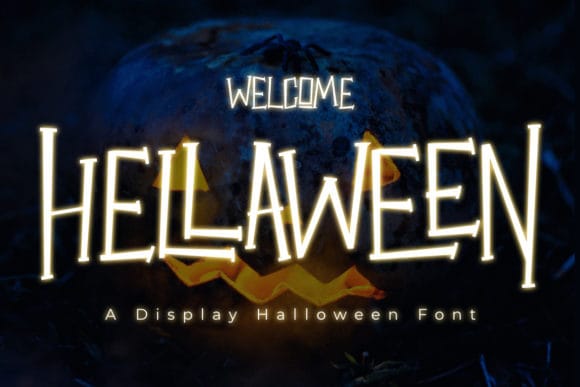
A cartoony slab serif that stays easy to read even at small sizes, which makes it a rare Halloween font you can actually use for body text, not just headlines.
Best for: Party invitation text, printable labels.
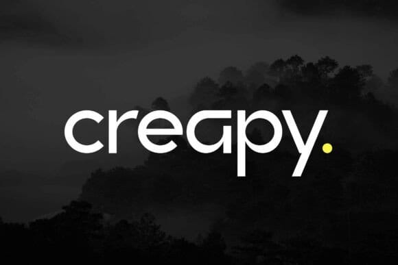
A bold, quirky modern sans-serif that breaks from the typical Halloween script — sharp, edgy shapes built for headlines rather than horror-movie drips.
Best for: Streetwear-style Halloween branding, bold poster headlines, edgy social graphics.
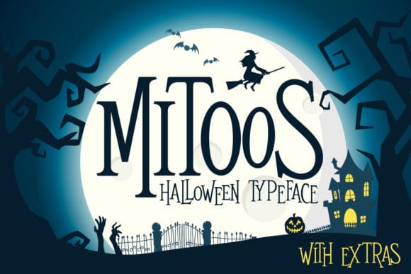
A brighter, more whimsical take on the season — this one leans toward charming rather than eerie, with rounded terminals that soften the overall effect.
Best for: Candy labels, cheerful Halloween social posts.
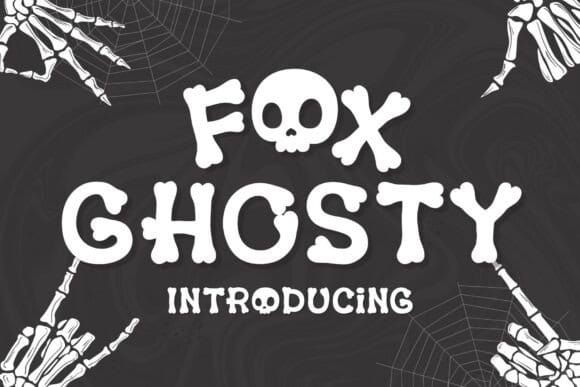
Bone-shaped letters and skull-themed details give this one a cartoonish, hand-drawn charm — spooky in concept but genuinely playful in execution, closer to trick-or-treat than horror movie.
Best for: Kid-friendly Halloween crafts, trick-or-treat posters, playful greeting cards.
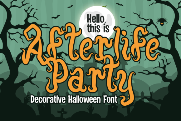
A festive display font that reads more "celebration" than "haunting" — a solid pick when your Halloween content needs to feel upbeat rather than moody.
Best for: Party decor, festive stationery.
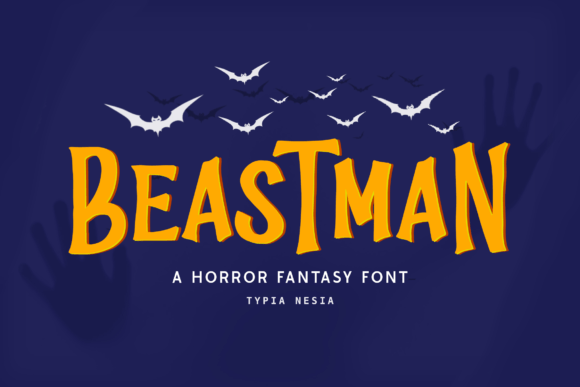
The gentlest font on this list — it carries just a touch of Halloween magic rather than horror, which makes it a good choice if your brand doesn't want to go full spooky.
Best for: Light seasonal branding, autumn-adjacent Canva templates.
Handwritten & Script Halloween Fonts
For designs that want the season referenced with a lighter, more elegant touch.
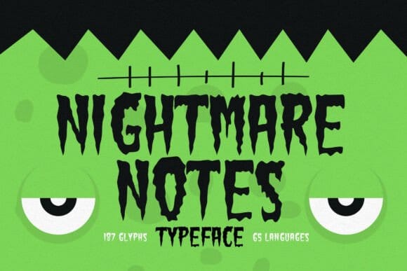
A handwritten-leaning font that mixes cartoon energy with a slightly chaotic, stitched-together feel — inspired more by classic Frankenstein aesthetics than by ghosts or witches.
Best for: Horror movie nights, offbeat Halloween posters.
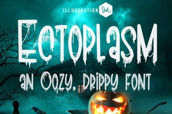
A whimsical, slightly eerie script that keeps things playful rather than heavy — the letterforms wobble just enough to feel intentional, not sloppy.
Best for: Spooky-cute party invites, seasonal social captions.
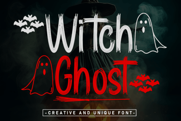
An elegant script with flowing, ethereal curves — the most refined pick in this group, trading cartoon charm for something closer to spectral sophistication.
Best for: Upscale Halloween invitations, boutique seasonal branding.
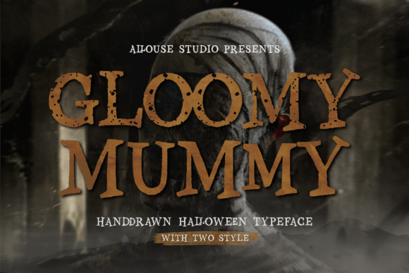
A hand-drawn font duo with irregular, textured strokes — leans toward Goosebumps-style spooky rather than gothic horror.
Best for: Kids' Halloween book covers, spooky-but-fun crafts.
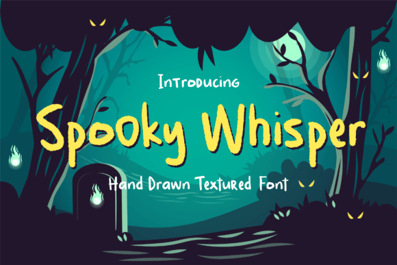
A textured handwritten font that's gentler than its name suggests — genuinely cute rather than eerie.
Best for: Cute Halloween stories for younger readers, gentle seasonal crafts.
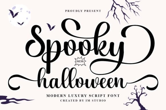
A softer, more feminine script than most Halloween fonts on this list — gentle strokes rather than jagged ones, closer to elegant than eerie.
Best for: Wedding-adjacent Halloween branding, invitations, sophisticated labels.
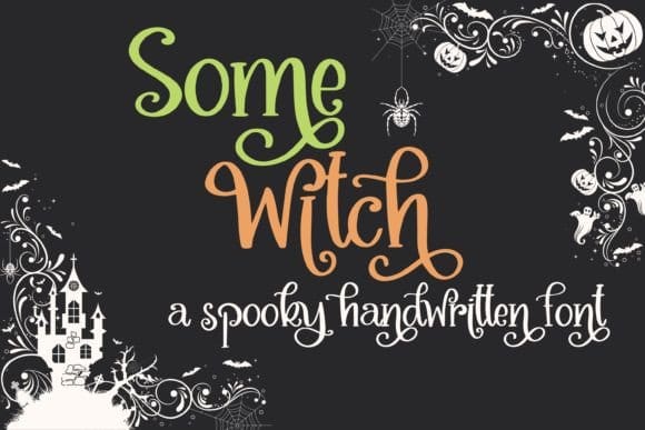
Combines calligraphy with whimsical, slightly doodled details — a script built for personality rather than pure elegance.
Best for: Spooky greetings, haunting posters, personalized party favors.
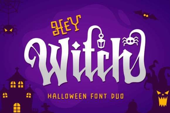
A script-and-display duo built around a "scary but cute" theme — gives instant two-level hierarchy without extra pairing guesswork.
Best for: T-shirt designs, book covers, layered poster titles.
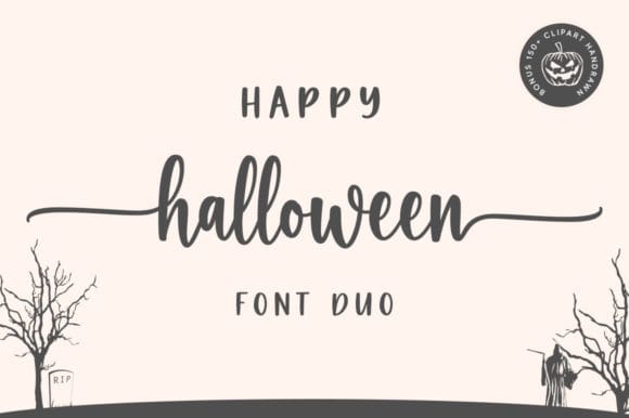
A two-font duo built to work together — one carries the "chic," the other the "cheery."
Best for: Craft projects, layered Canva titles, seasonal cards.
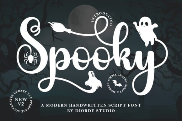
A genuinely handwritten script — loose, personal strokes with none of the display-font stiffness, making it one of the few entries here you could believably call "penned" rather than "designed."
Best for: Halloween social captions, casual party invites, quick craft labels.
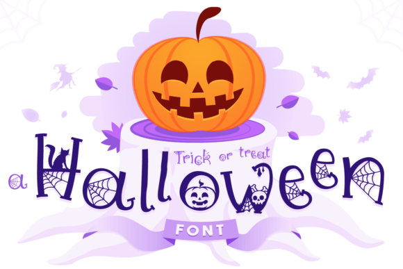
A graceful, understated script that leans into the softer side of Halloween lettering rather than horror-movie drama — a straightforward pick when a design needs a seasonal script without extra flourish.
Best for: Trick-or-treat printables, simple Halloween social captions, Cricut and Silhouette craft projects.
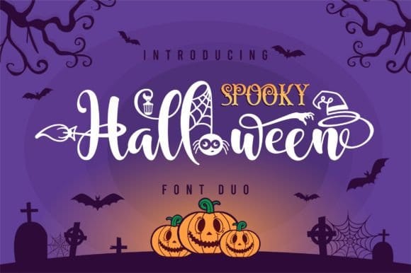
A font duo that pairs a handwritten script with a companion serif — one designed to carry the cute, decorative side of the season, the other to add a touch of structure so the combination doesn't drift too far into novelty territory.
Best for: Two-tone Halloween headers, layered Canva title graphics, playful-but-tidy party invitations.
Themed Character Fonts: Ghosts, Mummies & Zombies
Fonts built around a specific Halloween character, useful when your design already has a theme picked out.
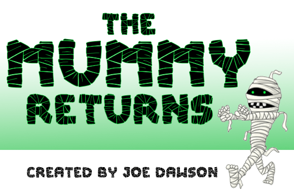
Letterforms shaped to echo old Egyptian aesthetics — a strong choice when your Halloween content leans into ancient curses rather than generic spookiness.
Best for: Mummy-themed party graphics, adventure-style invitations.
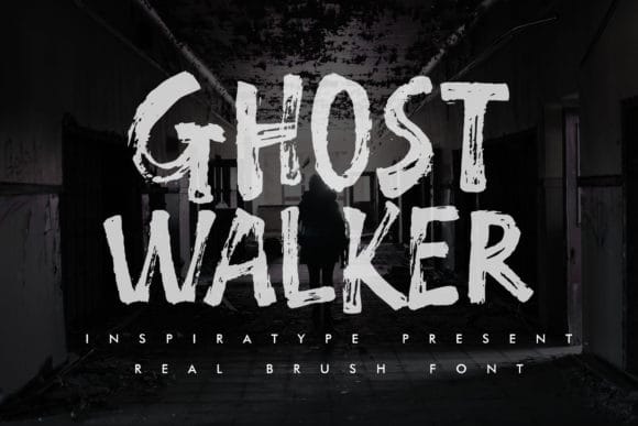
Quirky, slightly uneven characters that feel more mischievous than threatening — a good match for stationery and poster designs that want personality over polish.
Best for: Wall art, printable Halloween stationery.
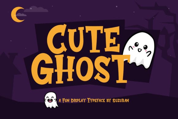
Despite the name, this one has enough edge to feel current rather than childish — a font that can carry a fresh, modern Halloween design.
Best for: Modern Halloween branding, dynamic social graphics.
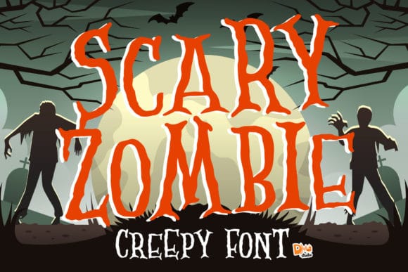
Quirky, slightly uneven strokes give this font real personality — flexible enough to work across a range of zombie- and horror-adjacent projects.
Best for: Zombie-themed event graphics, horror-fan merchandise mockups.
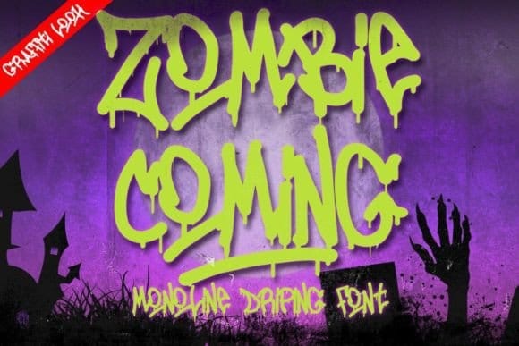
A monoline display font built around a dripping graffiti style, with swashes worked into select characters — closer to street art than classic horror lettering, which gives it a rougher, more urban edge than most gothic fonts on this list.
Best for: Branding, event headings, edgy invitations and signage.
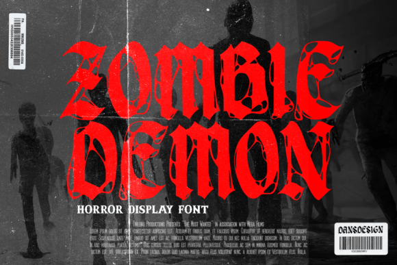
A highly detailed horror-metal display font — closer to a band's album cover than a Halloween party invite, with an aggressive, retro-urban edge distinct from the drippier fonts already on this list.
Best for: Music and event posters, tattoo branding, vintage-style horror logos.
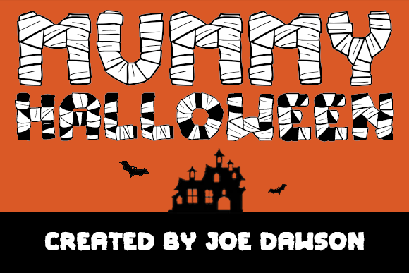
A second mummy-inspired display font from the same designer, with a slightly different letterform structure — useful if you want a Mummy Returns alternative with a bit more weight.
Best for: Bold Halloween headlines, themed packaging.
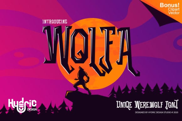
Bold, striking characters built for headline use — flexible enough to mix into werewolf, monster, or general "creature of the night" content.
Best for: Banner headlines, monster-themed branding.
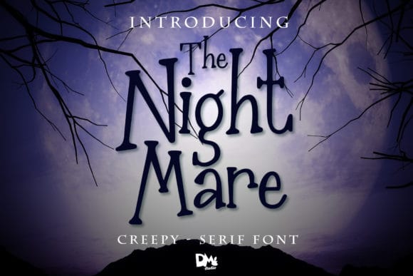
An intentionally weird, slightly off-kilter typeface — good for headlines and lettering prints that want to feel unsettling without going fully gothic.
Best for: Lettering prints, offbeat Halloween headlines.
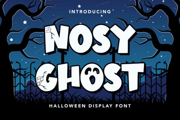
Bold and playful, with a full set of OpenType alternates — enough variation built in that a single font can carry an entire layered design without repeating itself.
Best for: Logotypes, posters, book covers.
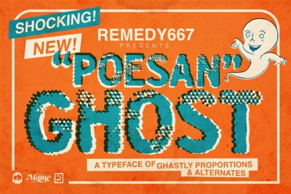
Bold, chunky letters with a rustic, zine-style roughness — a grittier ghost font than most, closer to punk flyer than party invitation.
Best for: Alternative branding, gig posters, streetwear graphics.
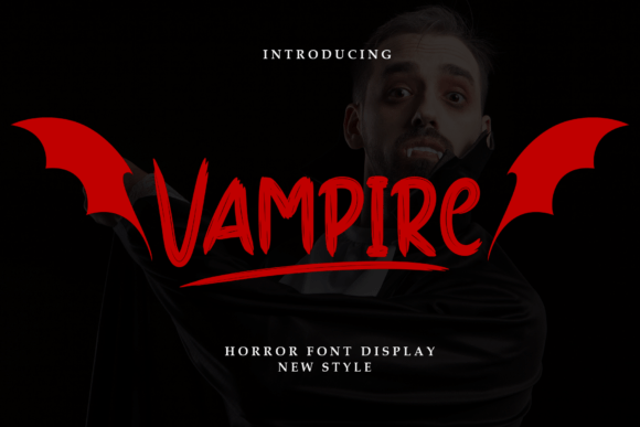
Sharp serifs and genuinely elegant letterforms — this is the one vampire font on the list that leans into seduction and mystery rather than horror-movie shock value.
Best for: Horror movie titles, macabre branding, gothic invitations.
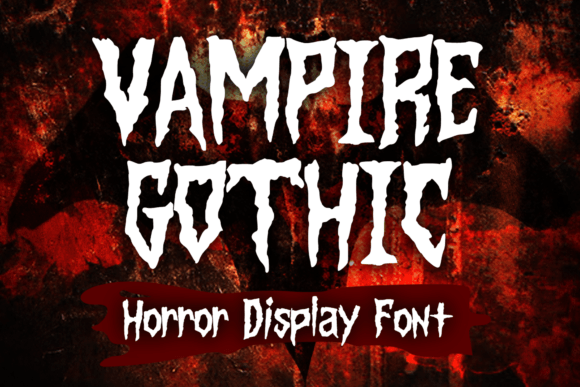
Inspired by vintage horror movies and metal album art — scary with a wink of playfulness, closer to a Halloween t-shirt than a wedding invite.
Best for: Merchandise, horror book covers, gig posters.
Fire, Blood & Bold Statement Fonts
For when your design needs maximum intensity.
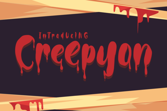
Bloody, high-impact characters that work best in a single bold color — this is a font that's meant to dominate a design, not blend into one.
Best for: Horror event posters, statement social graphics.
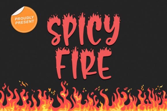
Letters that look genuinely on fire — a niche pick, but a strong one for any design built around flames, demons, or infernal themes.
Best for: Fire- or demon-themed Halloween graphics.
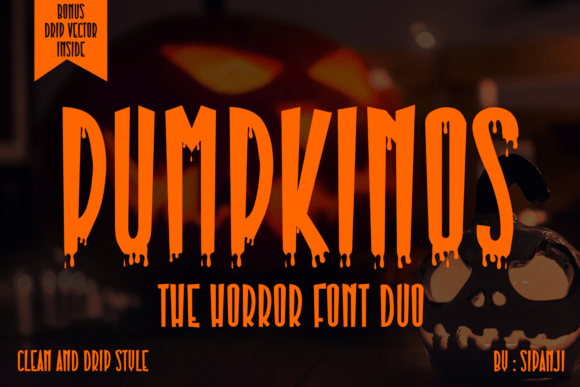
Comes loaded with special alternate characters, which makes it easy to build varied, non-repetitive combinations across multiple design pieces.
Best for: Pumpkin-themed posters, seasonal packaging.
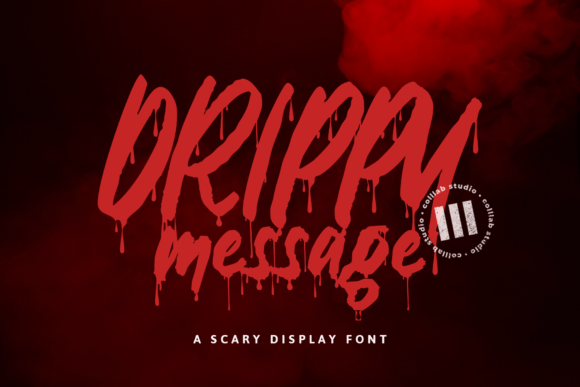
A dripping, blood-inspired display font that commits fully to the horror aesthetic — not a subtle pick, but exactly right when subtlety isn't the goal.
Best for: Horror movie graphics, high-impact Halloween banners.
How to Use These Fonts in Canva
Stick to one "voice" per design. Pick a font from a single category above rather than mixing a gothic display with a cartoon script — the categories exist because they don't naturally sit together.
Pair a loud display font with a plain sans for supporting text. Fonts like Drippy Message or Elastika are built to be read from a distance, not in a paragraph — keep body copy in something neutral.
Use Canva's shadow and outline text effects sparingly. Many of these fonts already carry texture and detail; stacking effects on top can make small text unreadable.
Lean on color instead of adding more decoration. Black, orange, and deep purple do most of the seasonal work — you often don't need extra graphic elements once the font itself is doing the heavy lifting.
Final Thoughts
Halloween fonts fail for one of two reasons: they're either too generic to register as seasonal, or so decorative they stop being readable. Everything above avoids both traps by doing one job well — whether that's dripping dread, cartoon charm, or a specific character reference — rather than trying to be all things spooky at once. Start with the mood your project actually needs, not the font that looks most impressive in a preview.
Twenty-nine fonts is a solid start, but it's a small slice of what's actually out there. Creative Fabrica's Halloween library runs well past 1,000 fonts — gothic, cartoon, script, and everything in between — so if none of these felt exactly right, it's worth spending a few minutes browsing the full collection.
Affiliate Disclosure: This article contains affiliate links to Creative Fabrica and Fiverr. If you purchase a product or service through these links, we may earn a small commission at no extra cost to you. We only recommend products and services we believe will benefit your YouTube channel. Read full disclosure.

YOU MIGHT ALSO LIKE

SUPER SPECIAL FONT BUNDLES
MODERN ELEGANT FONT BUNDLES
YOUTUBE THUMBNAILS BUNDLE KIT







Get a free YouTube thumbnail mini pack
Canva-ready templates + design tips straight to your inbox
By subscribing you agree to our Privacy Policy